UI Components
Lumen provides UI components so you can speed up your SaaS app development.
Installation
Required packages:
npm install @getlumen/react @getlumen/serverNextJS route
If you are using frontend components like UsageBadge it will be expecting a api/lumen endpoint by default.
For NextJS and Supabase you should copy this code into api/lumen/route.ts.
import { NextRequest, NextResponse } from "next/server";
import { getUsage } from "@getlumen/server";
import { createClient } from "@/utils/supabase/server";

export const GET = async (request: NextRequest) => {
  const supabase = await createClient();
  const {
    data: { user },
  } = await supabase.auth.getUser();

  if (!user) {
    return NextResponse.json({ error: "Unauthorized" }, { status: 401 });
  }

  const payload = {
    userId: user.id,
    apiUrl: process.env.LUMEN_API_URL,
  };

  const usage = await getUsage(payload);

  return NextResponse.json(usage);
};
If you are using a different tech stack email us at founders@getlumen.dev and we will reply in less than 1h if we are awake.
Pricing Table
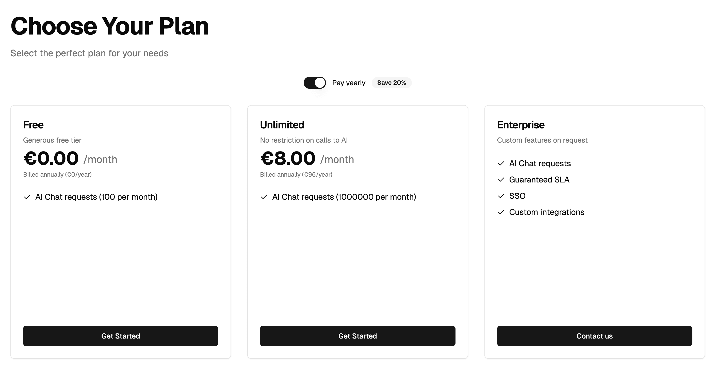
We recommend using our shadcn component so you can easily customize the styling manually or by prompting cursor:
npx shadcn@latest add https://getlumen.dev/pricing-table.jsonFrontend Integration
Import the PricingTable component and add it to your NextJS pricing page:
import { PricingTable } from "@/components/ui/pricing-table";
// OR if you don't want to use shadcn
// import { PricingTable } from '@getlumen/react'

export default function PricingPage() {
  return (
    <PricingTable
      lumenPublishableKey={process.env.NEXT_PUBLIC_LUMEN_PUBLISHABLE_KEY}
      userId={session?.user?.id}
      loginRedirectUrl="/login"
    />
  );
}
Required Props
lumenPublishableKey: Your Lumen publishable key from the environment variablesuserId: The ID of the currently logged-in userloginRedirectUrl: Clicking subscribe will redirect to this url if userId is null/undefined
Usage Badge
We recommend using our shadcn component so you can easily customize the styling manually or by prompting cursor:
npx shadcn@latest add https://getlumen.dev/usage-badge.jsonimport { UsageBadge } from "@/components/ui/usage-badge";
return (
<UsageBadge
featureSlug="ai-chat-requests"
label="AI Chat Requests:"
labelAfter="used"
creditCalculation="used"
/>;
)Parameters
Required Parameters
featureSlug(string): The slug of the feature whose entitlement usage should be displayed.
Optional Parameters
-
label(string, optional):- Label to show before the usage stats
- Default: Auto-generated from
featureSlugby capitalizing and formatting it (e.g., "api-calls" becomes "API Calls:")
-
labelAfter(string, optional):- Label to show after the usage stats
- Default:
"credits"
-
creditCalculation("used" | "available", optional):- Determines how credit usage is calculated and displayed
- Default:
"used" - When set to "used": shows credits used vs total
- When set to "available": shows credits remaining vs total
-
apiUrl(string, optional):- API endpoint for fetching Lumen entitlements
- Default:
${window.location.origin}/api/lumen
-
className(string, optional):- Additional CSS class names for the Badge component
- Default:
undefined(no additional classes)
-
theme("green" | "yellow" | "blue", optional):- Color theme for the badge
- Default:
"blue" - Determines the background and text colors when usage is within limits
- When over limit, all themes show red styling
Example with All Parameters
<UsageBadge
  featureSlug="ai-chat-requests"
  label="Custom Label:"
  labelAfter="remaining"
  creditCalculation="available"
  theme="green"
  className="my-custom-class"
  apiUrl="/custom/api/endpoint"
/>